
In today’s mobile-first world, a website that looks stunning on a desktop computer but crumbles on a phone screen is a recipe for disaster. This is where responsive websites come in, offering a seamless experience across all devices, from desktops to tablets and smartphones. But with so many options available, how do you choose the right responsive website for your business?
What is a Responsive Website?
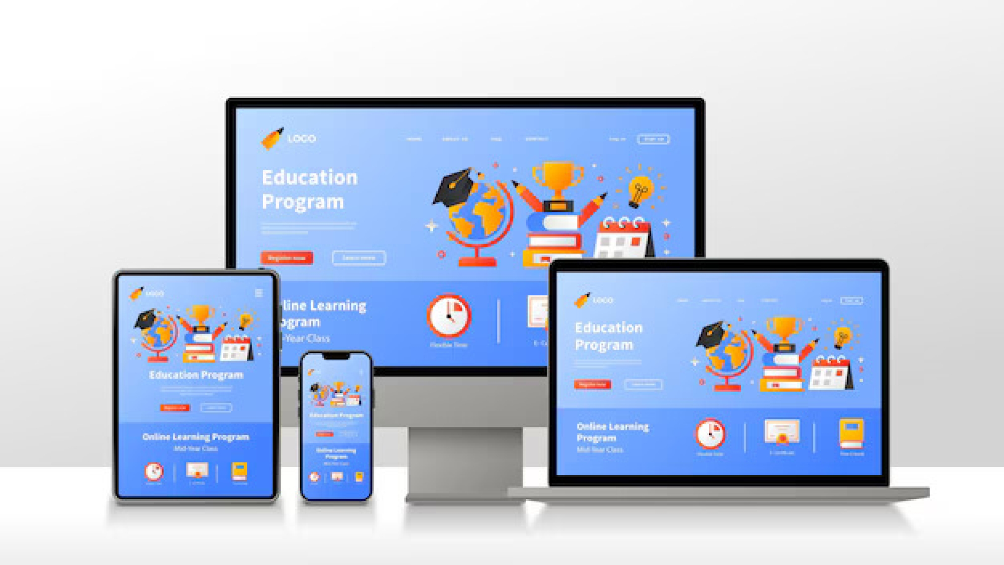
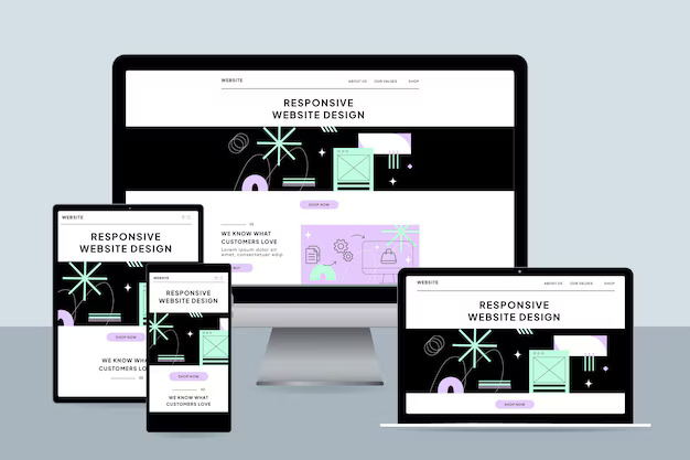
A responsive website is like a chameleon, adapting its layout and design to perfectly fit the screen size of the device it’s being viewed on. Images resize, menus adjust, and content flows beautifully, ensuring an optimal user experience (UX) regardless of the platform.
Here’s why responsive websites are crucial for your business:
- Enhanced User Experience: Imagine a user struggling to zoom in on text or navigate a cluttered menu on their phone. Frustration sets in, and they’re likely to bounce off your website. Responsive design eliminates this issue, keeping users engaged and happy.
- Improved Search Engine Optimization (SEO): Google prioritizes mobile-friendly websites in search results. A responsive website ensures your site is easily accessible on all devices, potentially boosting your search ranking.
- Increased Conversion Rates: A positive user experience translates to better conversions, whether it’s a purchase, a contact form submission, or a newsletter signup.
Selecting the Perfect-Responsive Website
Now that you understand the importance of responsive design, let’s delve into selecting the right website for your needs:
- Consider Your Budget: Responsive website development can range from cost-effective templated solutions to custom-built designs. Determine your budget and choose an option that aligns with it.
- Functionality Needs: Identify the essential features you need on your website. Do you require an online store, booking functionality, or a membership area? Choose a solution that can accommodate these functionalities seamlessly.
- Content Management System (CMS) Selection: A CMS allows you to easily update and manage your website content. for a user-friendly CMS like WordPress that even non-technical users can navigate.
- Mobile-First Approach: During the selection process, prioritize how the website looks and functions on mobile devices. After all, a significant portion of your traffic will likely come from smartphones and tablets.
- Scalability: Consider your future growth plans. Will you need to add more features or content down the line? Choose a responsive website that can scale with your business needs.
We’re Here to Help!
At RAMMS ADVISORS INFORMATION TECHNOLOGY, we understand the critical role responsive websites play in today’s digital landscape. We offer comprehensive website development and hosting services, crafting beautiful and functional responsive websites tailored to your specific needs.
Whether you require a basic business website or a complex e-commerce platform, our team of experienced developers will ensure your website looks fantastic and performs flawlessly on every device.
Contact us today for a free consultation and let us help you conquer every screen with a responsive website that drives results!

Add a Comment